By David F. Rooney
It’s unveiling is a month late, but the proposed rebranding campaign for Revelstoke now has a distinct look. You’ll either love it or hate it.
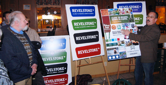
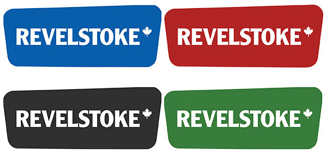
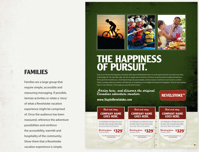
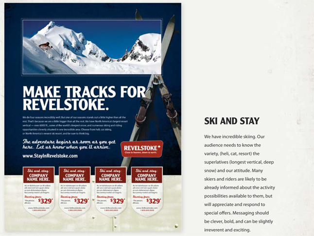
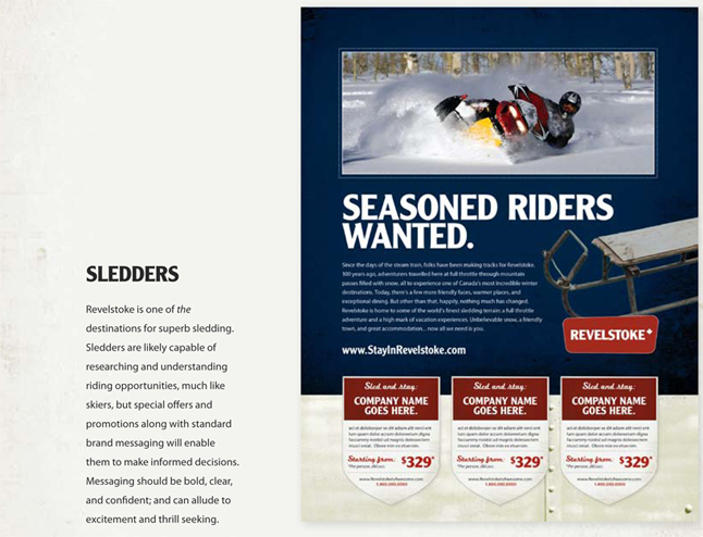
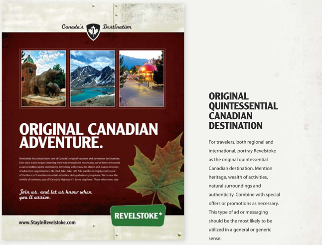
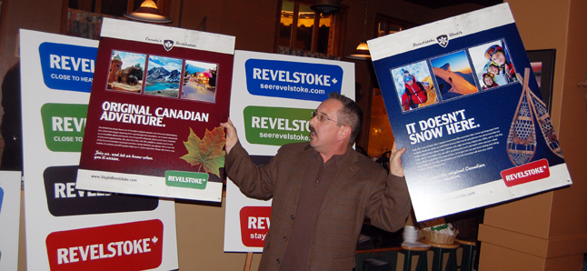
The logo proposed by the Revelstoke Accommodation Association was publicly unveiled at a Chamber of Commerce function at Bad Paul’s on Wednesday afternoon. It is intentionally reminiscent of 1950s and ’60s highway signage and, in the eyes of some, looks somewhat like a Travel Lodge logo. But while it may seem bland on its own it is certain — in my opinion — appears to work well when it is combined with the kind of high-adventure style ads. (You can see samples of logos in various colours as well as images of the proposed ad styles below.)
“Hopefully it will really help Revelstoke move forward,” Chamber President Don Teuton said at the unveiling, adding that the Chamber will get on board with the campaign. “I haven’t seen all of the ads they proposed. When I saw the logo by itself I didn’t really like it but when I saw it with some of the ads they are proposing it really worked well.”
Thom Tischik, marketing manager for the Revelstoke Accommodation Association, said the logo’s retro look was deliberate and its innocuousness actually works in its favour when it is combined with the kinds of outdoor adventure themes in the proposed campaign ads.
“It looks like a highway sign from when I was growing up,” he said. “I remember seeing signs that looked like it when we went to Yellowstone when I was a kid. That’s okay. We’re a highway town so it seems quite appropriate.”
What you don’t see in the campaign ads are bears or trains — two images that have traditionally been associated with past efforts to market Revelstoke. But when you consider the trend towards more tourism marketing here and the community’s reputation as a major all-season adventure tourism destination then the absence of those old standby symbols is quite understandable. The rebranding also includes a slogan: “Close to Heaven, Down to Earth,” which — as slogans go — probably catches much of the spirit of the Revelstoke community.
Most of the people who attended the Chamber’s networking event at Bad Paul’s and who closely examined the materials available liked what they saw. Some didn’t like certain things. Gwen Lips of Castle Joe Books didn’t like the font used in one ad and objected to some of the language used but seemed to like it in an over-all kind of way.
Shane McCallum of RevSoftware was very bullish on the campaign materials presented.
“I really liked it,” he said. “I was very impressed with what they came up with. I think it had a bit of a hip retro appeal with a giant helping of modern adventure smothered on top. The colours were nice. I liked the typeface a lot and the copy was catchy and engaging. My only complaint is that I think the logo looks a bit lame on its own, but overall it has my full endorsement, whatever that is worth.”
But you can decide for yourselves.
